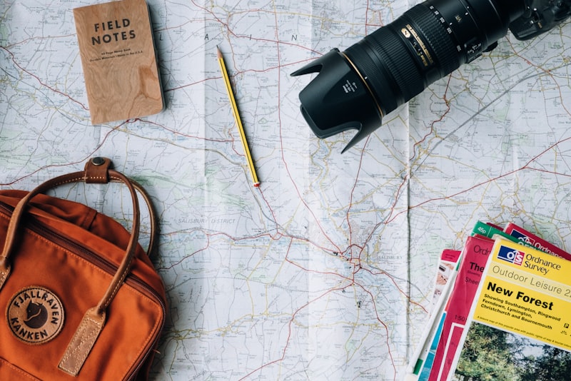
Data Visualization: Micronutrient Insights Unleashed

Data visualization transforms complex nutritional information into clear, actionable intelligence that empowers researchers, policymakers, and health professionals to address micronutrient deficiencies worldwide.

📊 The Critical Role of Micronutrient Mapping in Global Health

Micronutrient deficiencies affect over two billion people globally, creating what experts call “hidden hunger”—a silent epidemic that compromises immune systems, cognitive development, and overall well-being. While traditional reports and statistical tables contain valuable information, they often fail to communicate the urgency and geographic patterns of these deficiencies effectively. This is where data visualization becomes transformative.

Micronutrient maps provide a visual representation of deficiency patterns across regions, populations, and demographic groups. By converting raw data into intuitive visual formats, these tools enable stakeholders to identify hotspots, track trends over time, and allocate resources more efficiently. The power lies not just in displaying data, but in revealing patterns that would remain hidden in spreadsheets and text-based reports.

When properly designed, these visualizations bridge the gap between data collection and meaningful action. They speak a universal language that transcends technical expertise, allowing diverse audiences—from government officials to community health workers—to understand and respond to nutritional challenges in their regions.

🗺️ Understanding the Anatomy of Effective Micronutrient Visualizations

Creating impactful micronutrient maps requires more than simply plotting data points on a geographic canvas. The most effective visualizations incorporate multiple layers of information while maintaining clarity and accessibility. Color coding plays a crucial role, with intuitive gradients representing deficiency severity—typically moving from green (adequate) through yellow (borderline) to red (severe deficiency).

Interactive elements elevate static maps into dynamic exploration tools. Users can zoom into specific regions, toggle between different micronutrients, compare time periods, and access detailed statistics for particular areas. This interactivity transforms passive observation into active investigation, encouraging deeper engagement with the data.

Essential Components of High-Impact Nutritional Maps

  • Geographic precision: Detailed boundaries that reflect administrative divisions relevant to policy implementation
  • Temporal dimensions: Time-series capabilities showing trends and seasonal variations
  • Population context: Demographic overlays indicating vulnerable groups like children under five or pregnant women
  • Data transparency: Clear indication of sample sizes, data collection methods, and confidence intervals
  • Accessibility features: Color-blind friendly palettes and alternative text for screen readers

🔬 From Raw Data to Strategic Intelligence

The journey from laboratory results to actionable insights involves multiple transformation stages. Initially, biochemical assessments, dietary surveys, and anthropometric measurements generate vast datasets. These raw numbers, while scientifically rigorous, remain inaccessible to most decision-makers without proper interpretation and presentation.

Data visualization serves as the critical translation layer. Geographic Information Systems (GIS) technology combines spatial data with nutritional indicators, creating multi-dimensional representations that reveal relationships between deficiencies and factors like poverty, agricultural practices, food systems, and infrastructure development.

Advanced visualization platforms now incorporate machine learning algorithms that identify patterns human observers might miss. These systems can predict future deficiency hotspots based on changing environmental conditions, population movements, or economic shifts, enabling proactive rather than reactive interventions.

The Data Processing Pipeline

Successful micronutrient visualization projects follow a systematic workflow. Data collection occurs through surveys, clinical assessments, and sometimes satellite imagery analyzing crop health and food production. Quality control mechanisms ensure accuracy and consistency across different sources and time periods.

Standardization processes normalize data from various methodologies, making comparisons meaningful. Geocoding assigns precise coordinates to each data point, while statistical analysis identifies significant patterns and outliers. Finally, visualization designers craft representations that balance scientific precision with intuitive comprehension.

💡 Turning Insights into Intervention Strategies

The true measure of visualization effectiveness lies in its capacity to drive concrete actions. When health ministries can instantly see which districts have the highest rates of iron deficiency anemia, they can target supplementation programs with surgical precision. When agricultural planners visualize correlations between soil selenium levels and population selenium status, they can prioritize biofortification initiatives in the most impactful locations.

Micronutrient maps have revolutionized resource allocation decisions. Organizations working with limited budgets can prioritize interventions where they’ll achieve maximum impact. Visual evidence also strengthens advocacy efforts, making compelling cases for policy changes and funding allocations that might otherwise struggle to gain traction.

Real-World Applications Across Sectors

Public health departments utilize these visualizations to design targeted supplementation campaigns. For instance, mapping vitamin A deficiency prevalence alongside child mortality rates helps identify where supplementation programs could save the most lives. Educational institutions use similar maps to determine which schools should receive fortified meals or nutritional education programs.

The agricultural sector benefits equally. Visualizations showing zinc deficiency prevalence guide decisions about crop variety selection and soil amendment programs. Food fortification industries use regional deficiency maps to tailor product formulations and distribution strategies to specific market needs.

🌍 Case Studies: Visualization Driving Change

Ethiopia’s iodine deficiency mapping project exemplifies visualization’s transformative potential. By creating detailed provincial maps showing iodine status across the country, health officials identified unexpected pockets of deficiency in areas previously considered adequate. This led to targeted salt iodization program adjustments that reached an additional three million people.

In Southeast Asia, interactive vitamin D status maps revealed surprising urban-rural disparities. Contrary to assumptions, some urban populations showed higher deficiency rates due to indoor lifestyles and air pollution reducing sunlight exposure. These findings prompted public health campaigns specifically designed for urban contexts, including fortification of commonly consumed foods and targeted supplementation programs.

Bangladesh’s zinc deficiency visualization initiative integrated agricultural and health data, demonstrating clear correlations between rice-dominated diets and zinc status. This evidence supported introduction of zinc-biofortified rice varieties and dietary diversification programs, with follow-up mapping showing measurable improvements within three years.

🛠️ Technologies Empowering Modern Nutritional Cartography

Contemporary micronutrient mapping leverages sophisticated technological ecosystems. Cloud-based platforms enable real-time data updates, allowing maps to reflect the latest survey results immediately. Mobile data collection applications streamline field work, with health workers entering information directly into systems that automatically update central databases.

Geographic Information Systems like QGIS and ArcGIS provide powerful spatial analysis capabilities, while data visualization libraries such as D3.js, Tableau, and Power BI create compelling interactive interfaces. Open-source solutions democratize access, enabling resource-limited organizations to create professional-grade visualizations without prohibitive licensing costs.

Satellite remote sensing technologies add new dimensions to nutritional mapping. Spectral analysis of agricultural areas provides proxy indicators for crop nutritional content, while monitoring vegetation health helps predict food security challenges that may lead to deficiencies. Integration of these diverse data streams creates comprehensive pictures of nutritional landscapes.

Emerging Technologies Shaping the Future

Artificial intelligence is revolutionizing pattern recognition in nutritional data. Machine learning models trained on historical deficiency patterns can predict risk areas before deficiencies manifest clinically, enabling preventive interventions. Natural language processing extracts relevant information from unstructured health records, expanding available data sources.

Mobile applications bring micronutrient maps directly to frontline health workers. Field teams can access relevant visualizations on smartphones, checking local deficiency prevalence while conducting community visits. This real-time access to contextual information improves counseling quality and helps workers identify at-risk individuals more effectively.

📈 Measuring Impact: How Visualization Changes Outcomes

Organizations implementing data-driven approaches report significantly improved program efficiency. One international NGO documented 40% better targeting accuracy after introducing interactive deficiency maps, resulting in 30% more individuals reached with the same budget. Response times to emerging deficiency crises decreased by half when decision-makers could instantly visualize affected areas.

Cross-sector collaboration improves dramatically when stakeholders share common visual references. Health and agriculture ministries that might struggle to coordinate through technical reports find alignment easier when examining shared maps showing nutritional challenges and agricultural opportunities. This visual common ground facilitates integrated solutions addressing root causes rather than symptoms.

Educational impact extends beyond professional settings. When communities see visual representations of their nutritional status compared to neighboring areas, it creates awareness and motivation for change. Schools displaying local micronutrient status maps report increased engagement with nutrition education programs and higher adoption rates for dietary recommendations.

🎯 Best Practices for Actionable Nutritional Visualizations

Effective micronutrient mapping begins with clear objectives. Understanding who will use the visualizations and what decisions they need to make shapes every design choice. Maps intended for policy advocacy require different approaches than those supporting field-level program implementation. Context specificity ensures relevance and usability.

Simplicity often trumps comprehensiveness. While the temptation exists to display every available data point, cluttered visualizations overwhelm rather than inform. Strategic information layering allows users to access detailed data when needed while maintaining clear overview perspectives. Progressive disclosure principles guide users from general patterns to specific details.

Regular updates maintain visualization relevance and credibility. Outdated maps mislead decision-makers and undermine trust in data-driven approaches. Establishing sustainable update mechanisms—whether annual surveys or continuous monitoring systems—ensures visualizations remain valuable tools rather than historical artifacts.

Common Pitfalls to Avoid

  • Misleading color scales: Non-intuitive gradients that obscure rather than clarify severity levels
  • Missing context: Presenting prevalence without population size, making small affected populations appear equivalent to large ones
  • Ignoring uncertainty: Displaying point estimates without confidence intervals, suggesting false precision
  • Static presentations: Limiting visualizations to printed formats when digital interactivity would add substantial value
  • Technical jargon: Using terminology that excludes non-specialist audiences from understanding

🔄 Creating Feedback Loops Through Visualization

The most powerful visualization systems incorporate feedback mechanisms that complete the data-action-outcome cycle. When interventions based on mapped insights generate new data, updated visualizations show whether strategies are working. This creates continuous improvement loops where programs adapt based on visual evidence of effectiveness.

Dashboards displaying real-time program metrics alongside baseline deficiency maps enable adaptive management. Program managers can see immediately if interventions are reaching intended populations and adjust course when necessary. This dynamic approach replaces traditional static planning cycles with responsive strategies that optimize impact continuously.

Community-level feedback integration adds valuable ground truth to technical datasets. When field observations can be easily added to visualization systems, they enrich understanding and sometimes reveal data quality issues requiring attention. This participatory approach also builds local ownership and engagement with nutritional improvement efforts.

🌟 The Future of Micronutrient Data Visualization

Emerging trends point toward increasingly sophisticated yet accessible visualization tools. Virtual and augmented reality applications may soon allow stakeholders to “walk through” three-dimensional nutritional landscapes, experiencing data in immersive ways that deepen understanding. Personalized dashboards will deliver relevant visualizations to different user types automatically, from government officials to individual healthcare providers.

Integration with other health and development indicators will create holistic pictures of population wellbeing. Micronutrient status viewed alongside education levels, economic indicators, and healthcare access patterns reveals complex relationships informing comprehensive development strategies. These integrated visualizations support the systems thinking necessary for sustainable progress.

Democratization of visualization tools continues accelerating. As no-code platforms become more powerful, organizations without specialized technical staff can create professional visualizations. This accessibility shift promises to bring evidence-based approaches to smaller organizations and resource-limited settings where impact potential may be greatest.

🎓 Building Capacity for Sustained Impact

Technology alone cannot realize visualization’s full potential without human capacity to use it effectively. Training programs teaching data interpretation, visualization design principles, and evidence-based decision-making multiply the impact of mapping investments. These skills enable organizations to move beyond consuming visualizations others create to generating insights tailored to their specific contexts and needs.

Cross-functional teams combining nutritionists, data scientists, designers, and communication specialists produce the most effective visualizations. This collaborative approach ensures technical accuracy, visual clarity, and meaningful relevance to decision-makers’ needs. Building these multidisciplinary capacities within organizations creates sustainable capabilities rather than dependence on external consultants.

Knowledge sharing networks accelerate learning across organizations and geographies. When groups working on similar challenges share visualization approaches, successful strategies spread rapidly while ineffective ones are abandoned. Online repositories of visualization templates and case studies provide valuable starting points for organizations beginning their data visualization journeys.

Imagem

✨ Transforming Data into Lasting Change

Micronutrient mapping exemplifies how data visualization transcends mere information display to become a catalyst for meaningful change. By making invisible deficiencies visible, complex patterns comprehensible, and evidence accessible, these tools empower diverse stakeholders to address nutritional challenges with unprecedented precision and effectiveness.

The transformation from raw laboratory values to actionable insights represents more than technical achievement—it embodies a fundamental shift toward evidence-informed approaches in global health and development. As visualization technologies continue evolving and accessibility increases, their potential to accelerate progress toward universal micronutrient adequacy grows exponentially.

Success ultimately depends not on visualization sophistication but on commitment to acting on insights revealed. The most beautifully designed maps remain academic exercises unless they inform decisions, guide resources, and inspire action. When stakeholders embrace data visualization as a problem-solving tool rather than a reporting obligation, its true power emerges—transforming information into impact, and maps into movements toward better nutrition for all.

toni

Toni Santos is a soil researcher and environmental data specialist focusing on the study of carbon sequestration dynamics, agricultural nutrient systems, and the analytical frameworks embedded in regenerative soil science. Through an interdisciplinary and data-focused lens, Toni investigates how modern agriculture encodes stability, fertility, and precision into the soil environment — across farms, ecosystems, and sustainable landscapes. His work is grounded in a fascination with soils not only as substrates, but as carriers of nutrient information. From carbon-level tracking systems to nitrogen cycles and phosphate variability, Toni uncovers the analytical and diagnostic tools through which growers preserve their relationship with the soil nutrient balance. With a background in soil analytics and agronomic data science, Toni blends nutrient analysis with field research to reveal how soils are used to shape productivity, transmit fertility, and encode sustainable knowledge. As the creative mind behind bryndavos, Toni curates illustrated nutrient profiles, predictive soil studies, and analytical interpretations that revive the deep agronomic ties between carbon, micronutrients, and regenerative science. His work is a tribute to: The precision monitoring of Carbon-Level Tracking Systems The detailed analysis of Micro-Nutrient Profiling and Management The dynamic understanding of Nitrogen Cycle Mapping The predictive visualization of Phosphate Variability Models Whether you're a soil scientist, agronomic researcher, or curious steward of regenerative farm wisdom, Toni invites you to explore the hidden layers of nutrient knowledge — one sample, one metric, one cycle at a time.